
Why Are Restaurant Menus Suddenly So Hard to Read?
Restaurant menus can become harder to read as we get older because our eyes need more light and have more difficulty with small, low-contrast print. Dim restaurant lighting, glare, glossy menus, and tiny fonts can make the problem even worse—even if you already wear glasses.
If restaurant menus seem harder to read than they used to, your NOT imagining it.
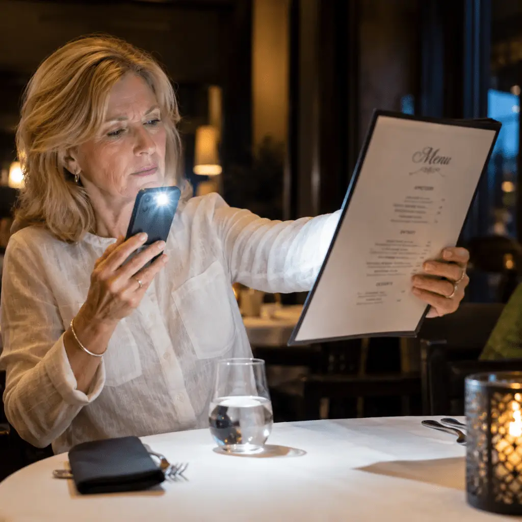
Then we start fumbling with reading glasses, pulling out our phone flashlight and pulling the menu back as far as we can to figure out what to order. The struggle is real.
Many people notice that somtime in their 40’s and 50’s, dim restaurants suddenly become frustrating places to read. Even with prescription glasses, menus can still be blurry and impossible to read.
Don’t worry, there is a much easier solution!
Why Do Our Eyes Need More Light As We Age?
Have you had to find or dig your phone out of your pocket or purse to try the “phone flashlight trick?
As we age, our eyes need more light because several changes happen at the same time. Our pupils tend to become smaller and adjust more slowly in dim lighting, less light reaches the retina, and contrast sensitivity decreases. Focusing on small print up close becomes more difficult.
In a dim restaurant, those changes make small or low-contrast menu’s much harder to see—even if you already wear prescription glasses.
Contrast Matters More Than Most People Realize
So, you pulled out your phone flashlight and you still can’t see. Its time to find your reading glasses too! Now you have glasses to take on and off and you must also juggle the phone…. NOT FUN.
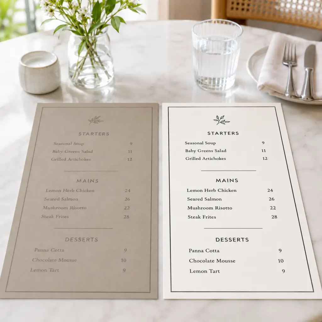
It’s not just the size of the print. Contrast can make a major difference in how easy a restaurant menu is to read.
Restaurant’s often like menus that use small fonts, lighter lettering, decorative typefaces, glossy paper, and low-contrast color combinations. Even when the words are technically large enough, the letters can blend into the background and become difficult to distinguish—especially in dim restaurant lighting.
Menus with dark lettering on a light background are generally much easier to read because the words stand out clearly from the page. If a menu looks blurry, faint, or washed out, poor contrast may be part of the problem—not just small print.
A Simple Way to Make Restaurant Menus Easier to Read
There is an easier, one-step solution for those hard-to-read restaurant menus.
Instead of putting your reading glasses on and taking them off, then reaching for your phone and turning on the flashlight, you can get extra light and magnification together in one small tool.
The Eschenbach easyPOCKET is compact enough to keep in a purse or pocket. Open it, the light turns on automatically, and you’re ready to read the menu.
One small tool. One step. No juggling glasses, your phone, and the menu.
See it being used on real restaurant menus below.
The easyPOCKET is available in 3×, 4× and 6× magnification and several colors, so you can choose the one that fits your needs and style. Small enough to keep with you, it’s an easy way to make restaurant menus—and other hard-to-read print—much easier to see.